최근 진행한 Python matplotlib 기초에 대한 연재를 마치면서 재미나고 이쁜 그래프 몇 개를 소개할까 합니다. 제가 만든건 아니구요.... Nicolas P. Rougier라는 분의 matplotlib tutorial에 있는 내용입니다. 꽤 재미난 코드들이 많으니 한 번 가서 둘러보시면 괜찮을 겁니다.
- Python MATPLOTLIB
- MATPLOTLIB 기초 기본적인 그리기와 설정 변경하기
- Python MATPLOTLIB
- MATPLOTLIB 마커의 활용
- Python MATPLOTLIB
- MATPLOTLIB scatter, bar, barh, pie 그래프 그리기
- Python MATPLOTLIB
- MATPLOTLIB subplot 사용해보기
- Python MATPLOTLIB
- MATPLOTLIB 히스토그램과 박스플롯 Boxplot
- Python MATPLOTLIB
- MATPLOTLIB 응용 이쁜~ 그래프들~^^
# -----------------------------------------------------------------------------
# Copyright (c) 2015, Nicolas P. Rougier. All Rights Reserved.
# Distributed under the (new) BSD License. See LICENSE.txt for more info.
# -----------------------------------------------------------------------------
import numpy as np
import matplotlib.pyplot as plt

n = 256
X = np.linspace(-np.pi,np.pi,n,endpoint=True)
Y = np.sin(2*X)

plt.figure(figsize=(10,8))
plt.plot (X, Y+1, color='blue', alpha=1.00)
plt.fill_between(X, 1, Y+1, color='blue', alpha=.25)

plt.plot (X, Y-1, color='blue', alpha=1.00)
plt.fill_between(X, -1, Y-1, (Y-1) > -1, color='blue', alpha=.25)
plt.fill_between(X, -1, Y-1, (Y-1) < -1, color='red',  alpha=.25)

plt.xlim(-np.pi,np.pi), plt.xticks([])
plt.ylim(-2.5,2.5), plt.yticks([])
plt.show()
위 코드는 파스텔 톤의 삼각함수에 대해 양의구간과 음의구간에 대해 다른 색상을 사용한 예제입니다.

보고서용으로 사용하기 괜찮아 보이는데요^^
# -----------------------------------------------------------------------------
# Copyright (c) 2015, Nicolas P. Rougier. All Rights Reserved.
# Distributed under the (new) BSD License. See LICENSE.txt for more info.
# -----------------------------------------------------------------------------
import numpy as np
import matplotlib.pyplot as plt

n = 1024
X = np.random.normal(0,1,n)
Y = np.random.normal(0,1,n)
T = np.arctan2(Y,X)

plt.figure(figsize=(10,8))
plt.scatter(X,Y, s=75, c=T, alpha=.5)

plt.xlim(-1.5,1.5), plt.xticks([])
plt.ylim(-1.5,1.5), plt.yticks([])
# savefig('../figures/scatter_ex.png',dpi=48)
plt.show()
위 코드는 랜덤변수를 뽑은 다음 arctan함수를 사용해서 사분면에 따라 colormap을 적용한 예를 보여줍니다.

# -----------------------------------------------------------------------------
# Copyright (c) 2015, Nicolas P. Rougier. All Rights Reserved.
# Distributed under the (new) BSD License. See LICENSE.txt for more info.
# -----------------------------------------------------------------------------
import numpy as np
import matplotlib.pyplot as plt

n = 12
X = np.arange(n)
Y1 = (1-X/float(n)) * np.random.uniform(0.5,1.0,n)
Y2 = (1-X/float(n)) * np.random.uniform(0.5,1.0,n)

plt.figure(figsize=(10,8))

plt.bar(X, +Y1, facecolor='#9999ff', edgecolor='white')
plt.bar(X, -Y2, facecolor='#ff9999', edgecolor='white')

for x,y in zip(X,Y1):
    plt.text(x+0.4, y+0.05, '%.2f' % y, ha='center', va= 'bottom')

for x,y in zip(X,Y2):
    plt.text(x+0.4, -y-0.05, '%.2f' % y, ha='center', va= 'top')

plt.xlim(-.5,n), plt.xticks([])
plt.ylim(-1.25,+1.25), plt.yticks([])

# savefig('../figures/bar_ex.png', dpi=48)
plt.show()
위 코드는 bar 그래프르 아래위 대칭으로 두도록 한 것입니다. 그것과 함께 bar 위에 텍스트를 찍은 방법도 같이 보시면 재미있습니다.^^

# -----------------------------------------------------------------------------
# Copyright (c) 2015, Nicolas P. Rougier. All Rights Reserved.
# Distributed under the (new) BSD License. See LICENSE.txt for more info.
# -----------------------------------------------------------------------------
import numpy as np
import matplotlib.pyplot as plt

def f(x,y):
    return (1-x/2+x**5+y**3)*np.exp(-x**2-y**2)

n = 256
x = np.linspace(-3,3,n)
y = np.linspace(-3,3,n)
X,Y = np.meshgrid(x,y)

plt.figure(figsize=(10,8))

plt.contourf(X, Y, f(X,Y), 8, alpha=.75, cmap=plt.cm.hot)
C = plt.contour(X, Y, f(X,Y), 8, colors='black', linewidth=.5)
plt.clabel(C, inline=1, fontsize=10)

plt.xticks([]), plt.yticks([])
# savefig('../figures/contour_ex.png',dpi=48)
plt.show()
위 코드는 contour 그래프를 그린 예제입니다.

# -----------------------------------------------------------------------------
# Copyright (c) 2015, Nicolas P. Rougier. All Rights Reserved.
# Distributed under the (new) BSD License. See LICENSE.txt for more info.
# -----------------------------------------------------------------------------
import numpy as np
import matplotlib.pyplot as plt

def f(x,y):
    return (1-x/2+x**5+y**3)*np.exp(-x**2-y**2)

n = 10
x = np.linspace(-3,3,3.5*n)
y = np.linspace(-3,3,3.0*n)
X,Y = np.meshgrid(x,y)
Z = f(X,Y)

plt.figure(figsize=(10,8))
plt.imshow(Z,interpolation='nearest', cmap='bone', origin='lower')
plt.colorbar(shrink=.92)

plt.xticks([]), plt.yticks([])
# savefig('../figures/imshow_ex.png', dpi=48)
plt.show()
위 코드는 다차원 함수를 2차 평면에 표현하는 그래프입니다.

# -----------------------------------------------------------------------------
# Copyright (c) 2015, Nicolas P. Rougier. All Rights Reserved.
# Distributed under the (new) BSD License. See LICENSE.txt for more info.
# -----------------------------------------------------------------------------
import numpy as np
import matplotlib.pyplot as plt

n = 20
Z = np.ones(n)
Z[-1] *= 2

plt.figure(figsize=(10,8))

plt.pie(Z, explode=Z*.05, colors = ['%f' % (i/float(n)) for i in range(n)])
plt.gca().set_aspect('equal')
plt.xticks([]), plt.yticks([])

# savefig('../figures/pie_ex.png',dpi=48)
plt.show()
이건 pie 그래프입니다만, 한 가지 담아 두시면 재미있을 것이 특정한 pie(^^)만 약간 도드라지게 표현한 것입니다.

# -----------------------------------------------------------------------------
# Copyright (c) 2015, Nicolas P. Rougier. All Rights Reserved.
# Distributed under the (new) BSD License. See LICENSE.txt for more info.
# -----------------------------------------------------------------------------
import numpy as np
import matplotlib.pyplot as plt

n = 8
X,Y = np.mgrid[0:n,0:n]
T = np.arctan2(Y-n/2.0, X-n/2.0)
R = 10+np.sqrt((Y-n/2.0)**2+(X-n/2.0)**2)
U,V = R*np.cos(T), R*np.sin(T)

plt.figure(figsize=(10,8))
plt.quiver(X,Y,U,V,R, alpha=.5)
plt.quiver(X,Y,U,V, edgecolor='k', facecolor='None', linewidth=.5)

plt.xlim(-1,n), plt.xticks([])
plt.ylim(-1,n), plt.yticks([])

# savefig('../figures/quiver_ex.png',dpi=48)
plt.show()
이건 quiver라는 화살표 그래프입니다. 다양한 설정을 줄 수 있는 것이 특징입니다.

# -----------------------------------------------------------------------------
# Copyright (c) 2015, Nicolas P. Rougier. All Rights Reserved.
# Distributed under the (new) BSD License. See LICENSE.txt for more info.
# -----------------------------------------------------------------------------
import numpy as np
import matplotlib.pyplot as plt

plt.figure(figsize=(10,10))
ax = plt.axes([0.025,0.025,0.95,0.95], polar=True)

N = 30
theta = np.arange(0.0, 2*np.pi, 2*np.pi/N)
radii = 10*np.random.rand(N)
width = np.pi/4*np.random.rand(N)
bars = plt.bar(theta, radii, width=width, bottom=0.0)

for r,bar in zip(radii, bars):
    bar.set_facecolor( plt.cm.jet(r/10.))
    bar.set_alpha(0.5)

ax.set_xticklabels([])
ax.set_yticklabels([])
# savefig('../figures/polar_ex.png',dpi=48)
plt.show()
위 코드는 bar 그래프의 축 설정을 극좌표계(polar)로 설정하여 재미있는 결과를 얻은 것입니다.

# -----------------------------------------------------------------------------
# Copyright (c) 2015, Nicolas P. Rougier. All Rights Reserved.
# Distributed under the (new) BSD License. See LICENSE.txt for more info.
# -----------------------------------------------------------------------------
import numpy as np
import matplotlib.pyplot as plt
from mpl_toolkits.mplot3d import Axes3D

fig = plt.figure(figsize=(10,10))
ax = Axes3D(fig)
X = np.arange(-4, 4, 0.25)
Y = np.arange(-4, 4, 0.25)
X, Y = np.meshgrid(X, Y)
R = np.sqrt(X**2 + Y**2)
Z = np.sin(R)

ax.plot_surface(X, Y, Z, rstride=1, cstride=1, cmap=plt.cm.hot)
ax.contourf(X, Y, Z, zdir='z', offset=-2, cmap=plt.cm.hot)
ax.set_zlim(-2,2)

# savefig('../figures/plot3d_ex.png',dpi=48)
plt.show()
위 코드는 3차원 그래프를 그리고, 그 투영의 느낌으로 contour를 그린 것입니다.

# -----------------------------------------------------------------------------
# Copyright (c) 2015, Nicolas P. Rougier. All Rights Reserved.
# Distributed under the (new) BSD License. See LICENSE.txt for more info.
# -----------------------------------------------------------------------------
import numpy as np
import matplotlib.pyplot as plt

eqs = []
eqs.append((r"$W^{3\beta}_{\delta_1 \rho_1 \sigma_2} = U^{3\beta}_{\delta_1 \rho_1} + \frac{1}{8 \pi 2} \int^{\alpha_2}_{\alpha_2} d \alpha^\prime_2 \left[\frac{ U^{2\beta}_{\delta_1 \rho_1} - \alpha^\prime_2U^{1\beta}_{\rho_1 \sigma_2} }{U^{0\beta}_{\rho_1 \sigma_2}}\right]$"))
eqs.append((r"$\frac{d\rho}{d t} + \rho \vec{v}\cdot\nabla\vec{v} = -\nabla p + \mu\nabla^2 \vec{v} + \rho \vec{g}$"))
eqs.append((r"$\int_{-\infty}^\infty e^{-x^2}dx=\sqrt{\pi}$"))
eqs.append((r"$E = mc^2 = \sqrt{{m_0}^2c^4 + p^2c^2}$"))
eqs.append((r"$F_G = G\frac{m_1m_2}{r^2}$"))

plt.figure(figsize=(10,10))

for i in range(24):
    index = np.random.randint(0,len(eqs))
    eq = eqs[index]
    size = np.random.uniform(12,32)
    x,y = np.random.uniform(0,1,2)
    alpha = np.random.uniform(0.25,.75)
    plt.text(x, y, eq, ha='center', va='center', color="#11557c", alpha=alpha,
             transform=plt.gca().transAxes, fontsize=size, clip_on=True)

plt.xticks([]), plt.yticks([])
# savefig('../figures/text_ex.png',dpi=48)
plt.show()
위 코드는 LaTeX로 표현된 수식을 마치 Tag Cloud로 표현하듯이 화면이 그려준 것입니다.

오늘은 matplotlib의 연재 마지막으로 뭔가 이쁜 그래프들을 보여드리고 싶었거든요^^...
'Software > Python' 카테고리의 다른 글
| [Seaborn 연재] lmplot과 kdeplot, distplot (8) | 2017.01.19 |
|---|---|
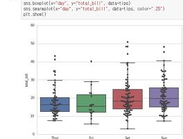
| [Seaborn 연재] set_style과 boxplot, swarmplot (4) | 2017.01.18 |
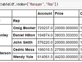
| Pandas pivot_table과 groupby, cut 사용하기 (6) | 2017.01.04 |
| MATPLOTLIB 히스토그램과 박스플롯 Boxplot (16) | 2016.12.30 |
| MATPLOTLIB subplot 사용해보기 (8) | 2016.12.29 |
| MATPLOTLIB scatter, bar, barh, pie 그래프 그리기 (8) | 2016.12.27 |
| MATPLOTLIB 마커의 활용 (8) | 2016.12.23 |